Typefaces and Fonts
Introduction

Typefaces are groups of designed text characters, such as Arial, Helvetica, and Times New Roman. Fonts are sub-sets of typefaces that have a consistent appearance, such as a 14 point and bold font in the Arial typeface. Typography—how typefaces and fonts present text—is very impactful on reading, which is a core component of visual accessibility.
This article primarily focuses on typefaces and fonts. To learn more about other aspects of typography and layout, please see Text/Typographical Layout.
Typeface Readability
When reading text, most people do not read or parse individual characters or even words. Instead, the eye quickly scans through text and parses patterns and groups of characters (typically 6-9 characters at a time) which are nearly instantaneously converted into meaning by the human brain. This subconscious process allows us to read and understand text content very quickly with high degrees of understanding, even though we aren't even seeing or thinking of characters and words.
It is only when characters or words are unfamiliar or introduce a barrier to that direct pattern-to-meaning process that we must pause to more closely examine or process characters or words. For optimal readability and understandability, the key is to avoid those interruptions.
Some principles to consider:
- Use simple, familiar, and easily-parsed fonts.
- Avoid character complexity
- Avoid character ambiguity
- Use a limited number of typefaces, fonts, and font variations.
- Consider spacing and weight.
- Ensure sufficient, but not too much, contrast between the text and the background.
- Avoid small font sizes and other anti-patterns.
Use simple, familiar, and easily-parsed fonts
Simple, familiar typefaces are easiest to parse and read because the mind already has or can quickly generate a model for the shapes and patterns of text. Unfamiliar or complex typefaces require additional time and orientation, resulting in character or word parsing (which is slow and cognitively intense) rather than pattern/block parsing (which is fast and less burdensome).
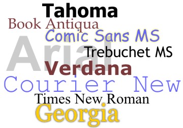 There is not a best typeface or font. Experts disagree on which typefaces provide the best readability. Some people indicate that sans-serif fonts are better for viewing on a screen and serif fonts are better for print, but this is becoming less of a concern due to the prevalence of high resolution displays and higher quality typefaces. Regardless, simplicity in typefaces is critical. The typeface should be familiar or easily-parsed so that it quickly becomes familiar. Many common and standard fonts available in modern operating systems meet these requirements.
Similarly, there is not one typeface that will be optimal for all users with dyslexia.
Typefaces should be chosen to align with the tone, messaging, and brand of the content. A cartoon font used on a bank web site, for example, would likely undermine the sense of trust and professionalism the user expects. Consider the differences between these two logos with the same text, but different typefaces.

Which of these banks would you trust more with your money?
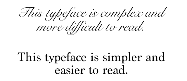
Avoid character complexity
Simpler shapes and patterns of typographical text are more quickly and accurately analyzed by the human mind. Be careful with complex fonts, especially for long sections of text.
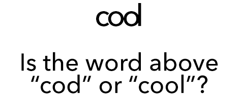
Avoid character ambiguity
When glyphs or characters within a typeface appear similar to another, this can introduce ambiguity which must be processed by the brain, thus impacting reading speed and understanding.
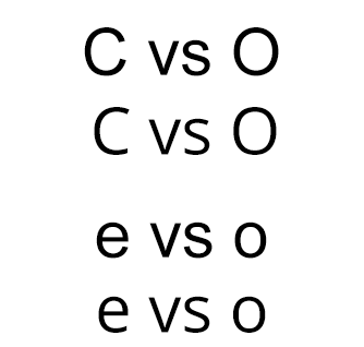
The texts above illustrate common ambiguities. The capital letters "C" and "O" and lowercase letters "e" and "o" in the Arial typeface look very similar due to the very narrow opening in the letters. This is contrasted with the wider opening and more distinct differences between "C" and "O" and "e" and "o" in the Open Sans typeface.
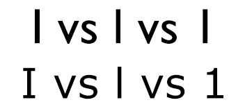
Similarly, capital "I", lowercase "l", and numeral "1" appear almost identical in Gill Sans, but are much more easily distinguished from each other in Verdana. Even though Verdana is a bit more complex, this minor complexity helps with disambiguation of characters.
Use a limited number of typefaces, fonts, and font variations
Each time you encounter a new typeface, font, or font variation, your mind must build a map or model of the characters and patterns to then more quickly parse words and process meaning. This requires cognitive effort and time. If the typeface is already familiar, this overhead is reduced.
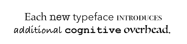
Be cautious when using multiple typefaces in the same document or web page. Ensure that typefaces/fonts align with types of content, such as one typeface or font for headings and another for body text.
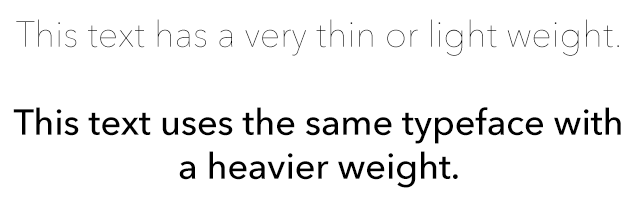
Consider spacing and weight
Adequate letter and word spacing can improve readability by providing greater separation and clarity between adjacent characters and words. When letters or words appear very close to each other, confusion can be introduced.
Additionally, the weight (meaning the thickness of the glyphs) can also impact perceivability and readability.
WCAG Text Spacing
WCAG requires that no loss of content or functionality occurs when the end user overrides page styles for paragraph spacing to 200% of the font size, text line height/spacing to 150% of the font size, word spacing to 16% of the font size, and letter spacing to 12% of the font size. Ensure that your page text can be modified without it disappearing or overlapping other page content.
Ensure sufficient, but not too much, contrast between the text and the background
Text is much easier to read when there is a sufficient contrast or brightness difference between the text and the background. The Web Content Accessibility Guidelines define measures for sufficient text contrast. Tools such as WebAIM's Color Contrast Checker make it easy to check contrast and determine WCAG compliance.
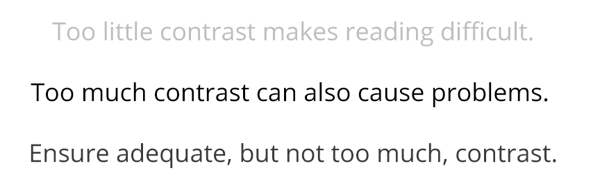
Black text on a white background is the default for web content, but this combination can feel stark and fatiguing, especially for long sections of text. Too much contrast may introduce halos or echos of text characters which can impact readability, especially for some with dyslexia. While WCAG does not have a maximum contrast threshold, you may want to style text with slightly lower contrast. This page, for example, uses a very dark grey body text color on white for slightly reduced contrast.
Avoid small font sizes and other anti-patterns.
In addition to text spacing, weight, and contrast, the size of text has a significant impact on readability. Although WCAG has no minimum font size requirement, it is still a valid usability consideration.
Relative font sizes (such as percents or ems) provide more flexibility in modifying the visual presentation compared to absolute units (such as pixels or points).
The font size chosen also impacts line length—the number of characters that appear per line. Line length and other text layout considerations are covered in WebAIM's Text/Typographical Layout article.
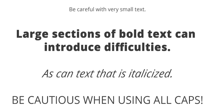
Be careful with longer sections of text that are entirely bold, italicized, capitalized, or styled in atypical ways. These font variations can make text more difficult to read—and each new variation requires some orientation by the user.
Real Text vs. Text Within Graphics
Real text provides many advantages over text within images. When content is presented as real text—meaning rendered a text characters in a web page—it is very adaptable. The user can customize it for better readability, such as by adjusting the line, word, and character spacing, changing the font face, changing text colors, increasing the text size without loss of fidelity, and translating to other languages. Additionally, true text can be copied and pasted, adapts to various screen sizes, is more compatible with search engines and low bandwidth environments, etc.
When text is instead defined within an image, it loses most of that adaptability. The Web Content Accessibility Guidelines require that if the same visual presentation can be made using text alone, an image is not used to present that text.
Text within images can become more pixelated, blocky, and difficult to read when enlarged, such as may be necessary by users with some visual disabilities.
The enlarged image of the word "University" above is difficult to read because it has become pixelated.
Embedded fonts
Modern browsers allow font embedding, a CSS technique that allows the browser to download fonts and then display text in those font faces. While most system-level typefaces are designed for some level of readability, many custom-designed typefaces are not. Care should be taken to use typefaces and fonts that maintain high levels of readability. Simply changing the font face has no impact on screen reader or other types of accessibility, so long as the actual underlying text is maintained in an accessible format.